A property technology platform simplifying how developments are managed from sales to aftercare. I led the creation of a complete brand identity and guidelines, shaping a clear, modern, and scalable brand across product and marketing.

client

Ubrix

year

'26

timeframe

2 Weeks

BRAND

PRINT

DIGITAL

TailHail App

Problem

Ubrix operates in a space often defined by complexity, fragmentation, and outdated tooling. The challenge was to create a brand that could cut through this noise - communicating clarity, efficiency, and confidence while still feeling approachable to a wide range of users, from site teams to senior stakeholders.

Discovery

The core insight was that Ubrix is not just a tool, but a connector across the entire property lifecycle - from build and sales through to aftercare. This idea of connection and flow became central to the brand strategy, alongside a need to communicate clarity and efficiency. From this, three guiding principles were defined: clarity over complexity, system over decoration, and confidence without noise. These principles ensured the identity would remain focused, scalable, and aligned with the product experience.

Ubrix® Billboard Advertising

Ubrix® Social Templates

Ubrix® Brand Guide

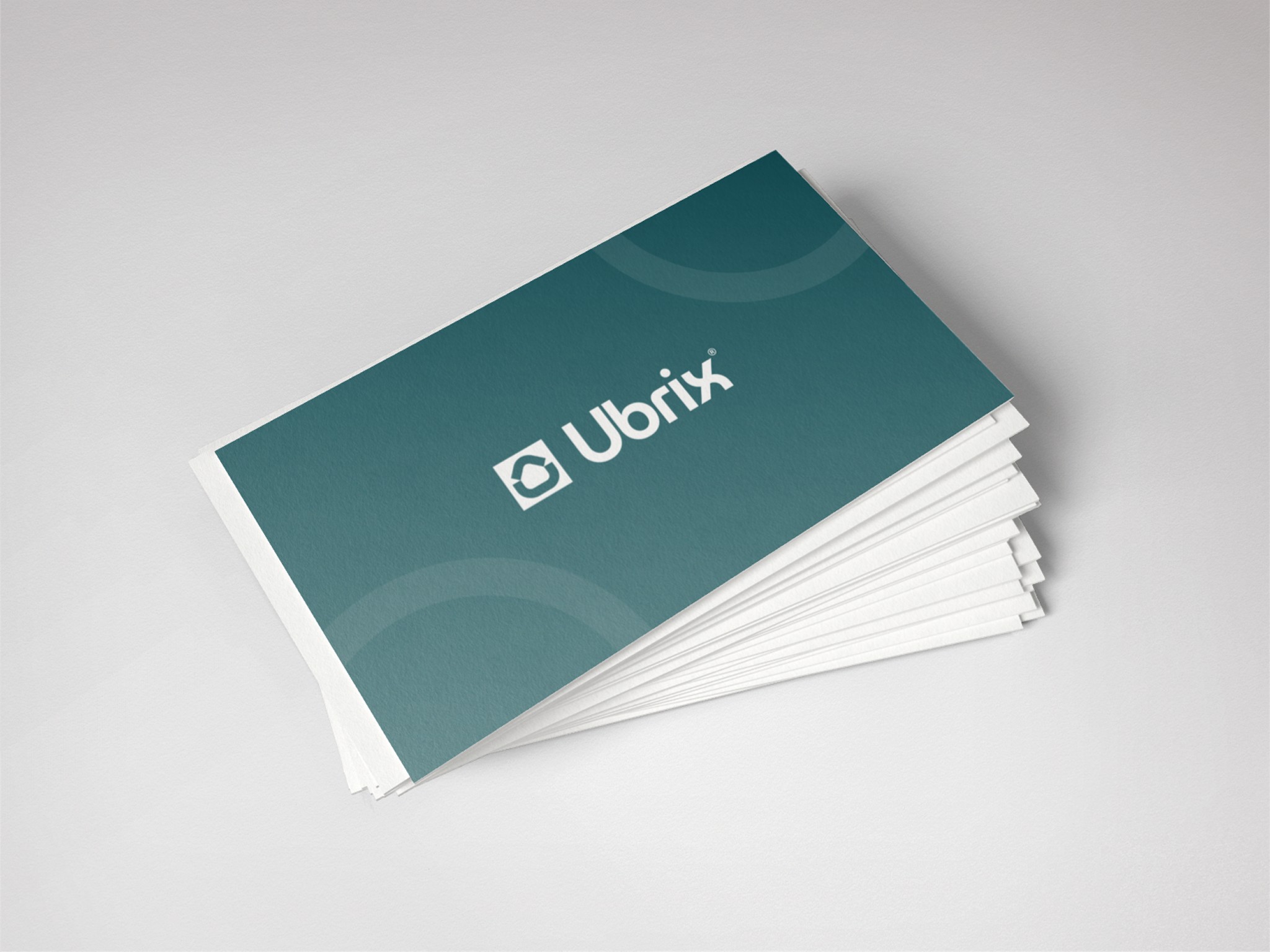
Ubrix® Business Cards

Design & Iteration

The visual identity was built as a cohesive system rather than a set of standalone elements. The logo draws on ideas of structure and modularity, referencing both construction and digital workflows, while maintaining a clean and geometric simplicity. A refined colour palette balances professionalism with subtle vibrancy, helping the brand stand out without losing credibility. Typography was selected for clarity and legibility, particularly within content-heavy product environments, with a strong hierarchy to support usability. Supporting this, a flexible pattern system was developed to express modularity and connection, alongside an image direction that focuses on authentic environments and human interaction, avoiding generic stock and reinforcing the link between physical and digital experiences.

The visual identity was built as a cohesive system rather than a set of standalone elements. The logo draws on ideas of structure and modularity, referencing both construction and digital workflows, while maintaining a clean and geometric simplicity. A refined colour palette balances professionalism with subtle vibrancy, helping the brand stand out without losing credibility. Typography was selected for clarity and legibility, particularly within content-heavy product environments, with a strong hierarchy to support usability. Supporting this, a flexible pattern system was developed to express modularity and connection, alongside an image direction that focuses on authentic environments and human interaction, avoiding generic stock and reinforcing the link between physical and digital experiences.

Outcome

The final identity positions Ubrix as a clear, modern brand within a traditionally conservative industry. It successfully translates a complex product into a visual system that feels intuitive, scalable, and cohesive across all touchpoints. By balancing technical precision with human clarity, the brand communicates trust, efficiency, and innovation, ultimately reflecting Ubrix’s core purpose of simplifying and connecting every stage of the housing journey.

The final identity positions Ubrix as a clear, modern brand within a traditionally conservative industry. It successfully translates a complex product into a visual system that feels intuitive, scalable, and cohesive across all touchpoints. By balancing technical precision with human clarity, the brand communicates trust, efficiency, and innovation, ultimately reflecting Ubrix’s core purpose of simplifying and connecting every stage of the housing journey.